What this project shows
- mobile UX designed for panic-state cognition rather than calm reflective browsing
- a narrow crisis path that begins from a widget and avoids menu navigation
- large targets, stable placement, low-density language, and soft but legible contrast
- exit treated as product success rather than retention failure
Challenge
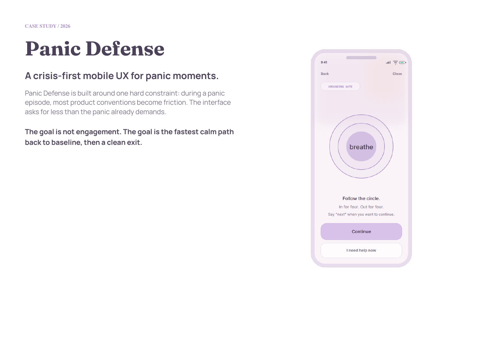
Panic Defense is a concept app for acute panic moments, not reflective wellness use. It treats cognitive overload, motor imprecision, and reduced reading tolerance as primary design constraints. The product begins from a widget, moves through breath and sensory grounding, asks one branch question, then either lets the user leave or offers focused support.
Most mental-health products are designed for calm, reflective users. Panic episodes are different: attention narrows, reading tolerance drops, and even simple choices can feel expensive. That makes ordinary app patterns risky.
Flow contract
The product model is deliberately narrow: get in fast, regulate physiology, anchor attention, ask one branch question, then exit or offer focused support. The interface is not a wellness dashboard. It is a short crisis path.
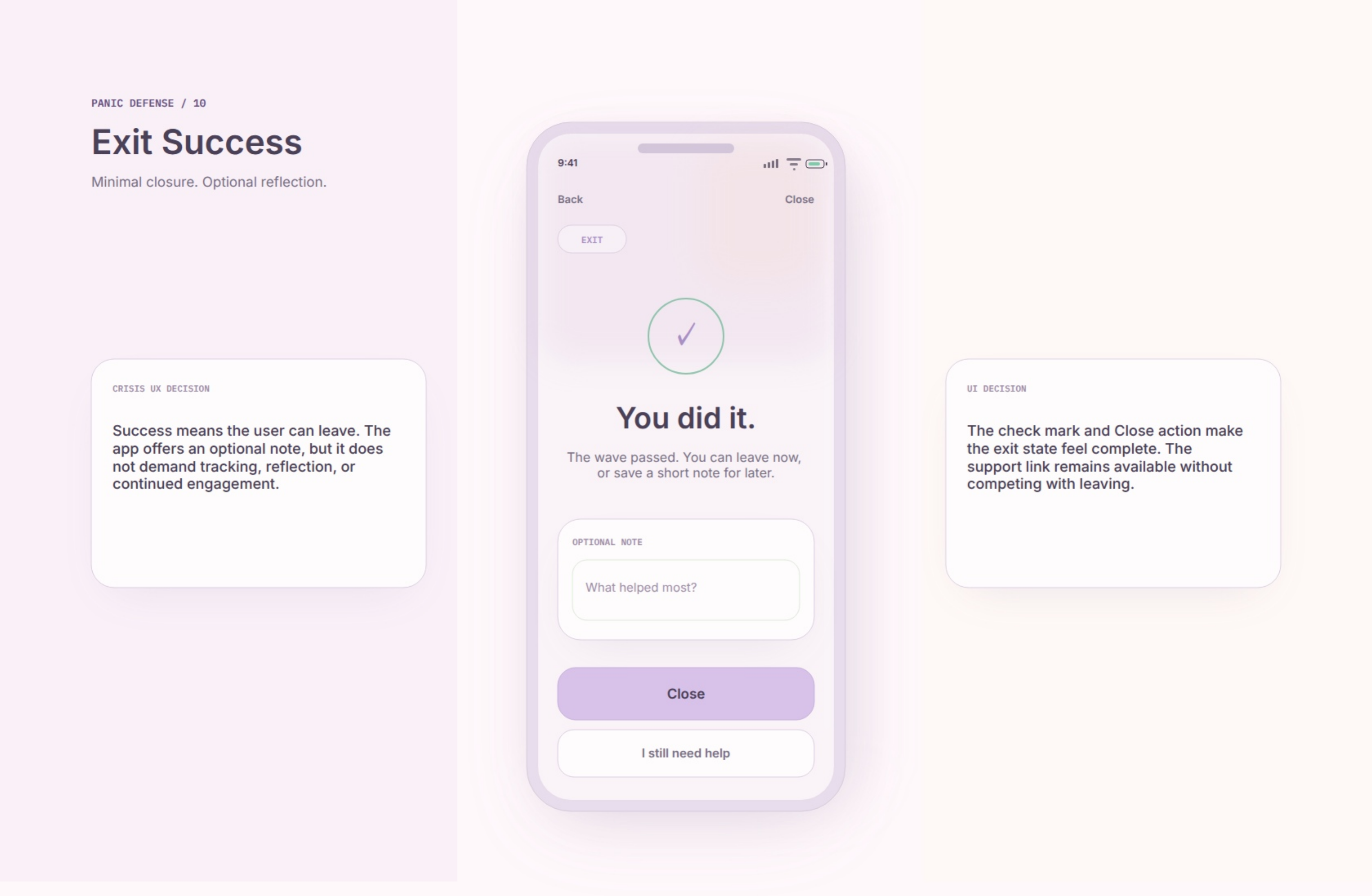
The goal is not engagement. The goal is the fastest calm path back to baseline, then a clean exit. That is why success means the user can leave, and support options remain available without competing with leaving.
Design constraints
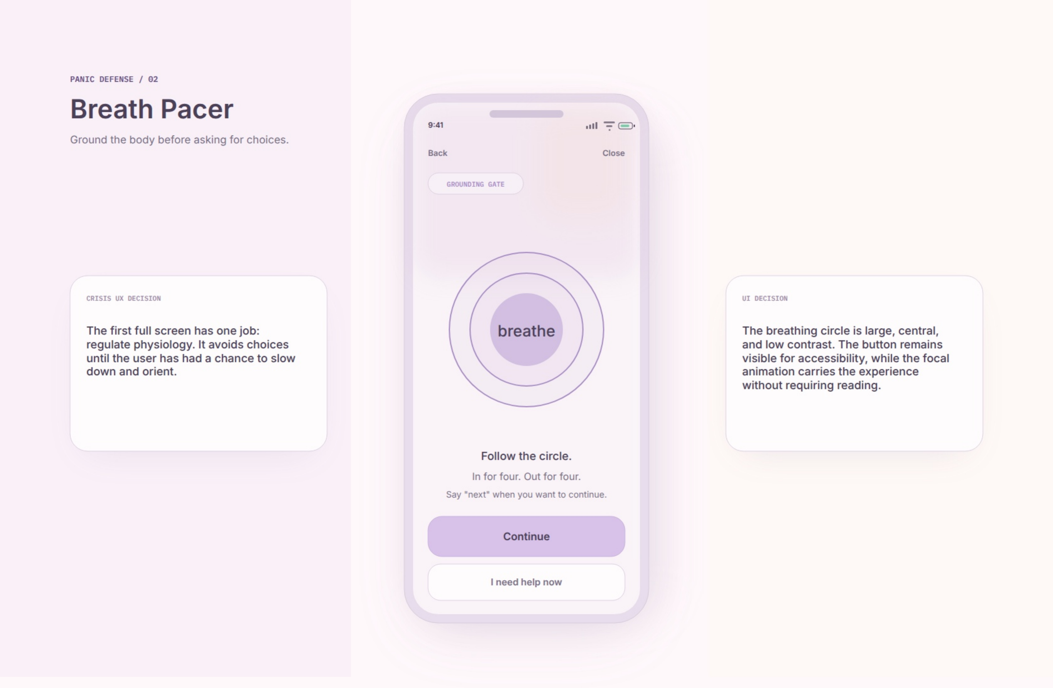
Each screen presents one action or one short sentence. Controls are large, full-width where possible, and forgiving for trembling hands. Breathing and sensory anchors happen before the check-in branch, and every voice action has a visible tap alternative.
The voice model is intentionally constrained. A web app should not promise OS-level launch from Siri or Google Assistant. In-app voice commands are viable only after the app is open, microphone permission is granted, and the browser supports speech recognition.
State model
A production build should start from the crisis-path state model: Entry Widget, Breath Pacer, Safety Statement, Anchors, Check-In, Exit Success, and Support Options. History, settings, and broader product surfaces stay out of the crisis path.
The product is successful when it gives the user enough structure to get through the moment and enough restraint to let them leave.